Search Results

Results tagged “art”

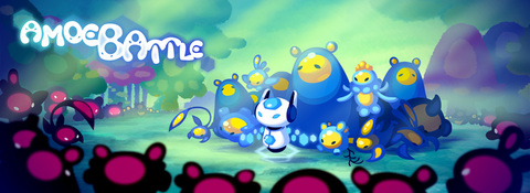
Amoebattle is Released!

Hey guys! Sorry for not updating, as you've probably guessed I've been very busy!! First, I am definitely continuing work on Directions of Destiny--it is a very precious part of me that I will never abandon, and I am constantly working on the story behind the scenes.

The reason why I have been so quiet is because for the past year and a half, among many many game projects I've been working on, I've also been acting as the Lead Artist on a Real Time Strategy game for Nintendo DSi and iPhone/iPad called Amoebattle!

Amoebattle

I am very proud of this project because not only has it finally been released in the App Store this week, today it has just been highlighted by Apple as a Featured Game!! If you have an iPhone, iPad or iPod Touch, check out the Games section of the App Store and you'll find our game :D!

I played a large part in the development of this project, including character sprites and animation, backgrounds, and UI, but I didn't do it alone! I also had the help of other extremely talented artists like Fenryk, who designed all the characters and created the environment for the final stage, and Barlee and Drunkpugs who both also helped tremendously with the environments!!

Please check it out and support the project, especially if you're into RTS games like Starcraft or even Pikmin. It's available to purchase for just $4.99! It is also coming to DSiWare and the 3DS e-Shop very soon for the same price!

Now that it's out, I can breathe a huge sigh of relief, and I see a lot more time spent on Directions of Destiny :] Thanks everyone and I'll update again soon!
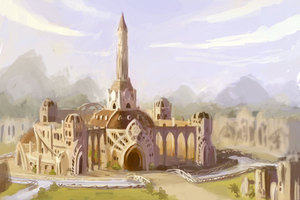
Alatus Tower

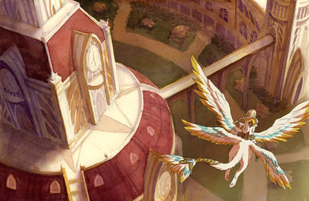
Alatus Tower

Another concept piece that I did last semester along with the last two watercolor pieces. :B I had sekritly put this one on my personal site a while back but I never actually put it up on here, so in case anybody missed it before, here it is!

I altered the design of Azalea's animus a little :'D Also this is Azalea circa 13 years old or something so shorter hair and no fancy council uniform yet!

Incidentally I just got hired onto a REAL GROWN-UP JOB which I'll be starting in March! The commute is pretty far (read: ridiculous) but I'm gonna be take my role in protecting our environment and ride the train there every day so I can work on this comic during the ride (as opposed to killing myself slowly suffering through four hours of car traffic everyday ha ha ha uggghhh).

Yay steady income @w@

Student Council

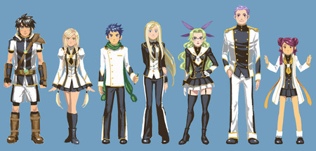
Student Council Characters

Now that I'm graduated I've been able to dedicate more time toward writing Directions of Destiny :B This was a student council lineup that I did a couple months back. I started on some other characters too but I didn't finish them 'cause there were too many other things I had to do at the time. D':

Zephan is in his PE uniform/battle gear :B

Pixel Sprites

It's been a while since I updated :'B

I've graduated! I've been working in a game studio! I've been doing freelance stuff. I've been writing my comic!!

I don't have much more to say for myself :'D

Here's some pixel sprites that I've done for some games that I've been working on over the past several months.

Fan Art!

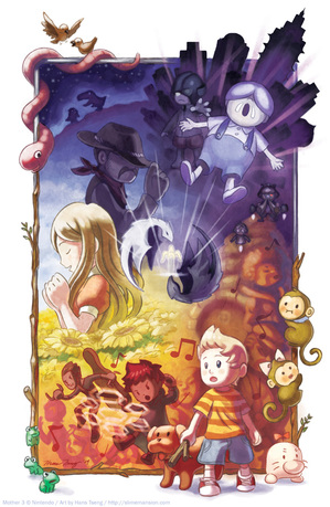
Mother 3Done with finals, passed all my classes, and I just got back from a wonderful weekend at Fanime in San Jose! Now it's back to work for me :> Inbetween the Directions of Destiny stuff, I thought I'd put on the blog some of the fan art I've done over the last year that I hadn't put on the blog yet (even though they're technically on the website ha ha D:)

This is fan art of Mother 3! If you've played Earthbound on SNES, this is the sequel! Y'all should play it if you haven't D: It was an amazing game and it made me shed tears. :') I tried to put in as many elements of the game into this illustration without being too revealing.

Incidentally, the linework was originally done in pencil on paper, but then I decided to make some significant changes so I ended up redoing the linework completely in Illustrator.

The Headmaster's Office

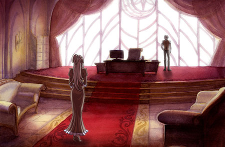
Here's the second in the series of watercolor scenes that I'm working on :D It's the Alatus Headmaster's office!

Headmaster's Office

This one was a little tricky because of all the red going on, and with watercolor different colors have different physical properties when you put it on paper. With the red, after you put it on it tends to come off really easy if you do anything on top of it, and ideally I think it should have been left for the last layer. BUT it wasn't, so once it was put on, the rest of the painting felt like walking on tightrope. D:

SO ALSO. I got a better scan of this painting than the last one! The flatbed scanner at work actually scanned my coldpress paintings without any of the coldpress texture! So that means I don't have to do anything in hot press after all ;D (my prior experience with using hot press was relatively unpleasant, so this development pleases me.)

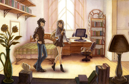
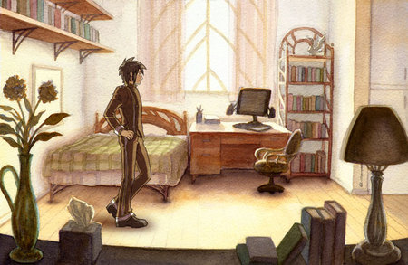
That being said, I rescanned the dorm room picture and changed up the scene a bit. :>

Dorm Room with Zephan and Ryan

This would be a year prior to the start of the story, with Zephan and Ryan both incoming freshman to the Alatus high school. Ryan, having been a student of the Alatus middle school, is showing Alatus new arrival Zephan around the dormitories.

I'm almost done with the next two paintings so I'll post them up within the next week ;D (which happens to be FINALS WEEK BTW alfksdfjsa;dfaj)

Dorm Room

Dorm Room with Zephan

This is the first in a series of watercolor background paintings that I'm working on. :> Unlike the previous environment thumbnails which include places outside the school, these paintings will be exclusively of various areas within the campus of the Alatus Institute.

I stuck Zephan in there to see how it looks, but I'm kind of indifferent about it, because the tooth texture of the watercolor paper stands out a little too much :<a. Apparently if I used a really really good scanner the tooth won't stand out so much though, but by really really good apparently they mean like $1000+ good Dx. It's an interesting effect, but I think I'll try using a hot press smooth paper some time and seeing how it'd look once a character is slapped onto it.

Incidentally, even though Zephan's standing here, this isn't actually his room. D: It's just a showcase dorm, so maybe he's just checking it out on a tour or something D:

Alatus Environments

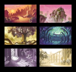
The school semester is coming to a close in the coming weeks :D I thought I'd use this chance to post a few thumbnails of some environments I'd been working on for Directions of Destiny.

Alatus Institute Unfinished

Alatus Environment Thumbnails

Some of these locations you might recognize from the comic, others have yet to be mentioned at all. But it's been very fun working on these concepts, and I'll be sure to put up the full finished paintings when I'm done!!

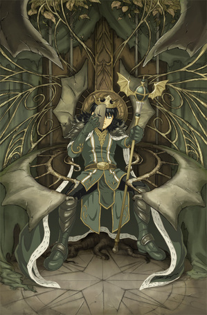
King Zephaniah

King Zephaniah

I feel like I have all these Internet outlets at my disposal, yet I've failed to make effective use of any of them. D: I guess I rarely feel like I have things worth saying, but with Facebook and Twitter and this whole brave new world beyond LiveJournal these days, I feel like it's such a waste to not use them!! SO, now I'm trying to update my presence on the Internet more?

Anyway, a long long time ago I did this picture, and so finally this past summer I gave it a partner illustration :D This was already posted in some other outlets, including as part of the main art gallery on this site, but I thought I'd make a blog entry about it anyway Dx

Truth be told, I had actually put a piece of tracing paper over the original Queen Azalea illustration to do a lot of the detail work in this one, but I tried to give this one a more earthy feel, and where places in the Queen Azalea one were more clean, I tried to mess it up just a bit in this Zephan version.Their color schemes, red and green, are complements too.

I plan on using this image as the cover of chapter 2.7 when I finally get around to doing the actual comic again, but who knows, maybe I'll change my mind about what to put there when that time comes, ha ha Dx

I'm saying it here, I'm going to try to update at least once a week from now on!!

New layout!

Hans D:

It's been a while since I updated but I thought it was about high time that I did something about the layout of this site D: I was getting sick of the blue, and the site organization was getting in my nerves too. I hope with this layout everything is more accessible and easier in the eyes :D

Also you may notice that I now have art categories specifically for visual development and vector graphics now! Between classes and my job on Graphic Services on campus, I've been doing a lot more of these kinds of art lately, so I figured they deserve their own categories now!

I think most sections work properly, although I still have to put up a lot of my old art back up on the art gallery, and the store is still not up at all, and I haven't finished my profile at all ha ha Dx. I'm also still planning on fixing up a lot of the current art here though so check back every now and then to see if anything is new :'D

New layout

As you may have noticed, I've managed to put up a new layout for this site like I said I would in the last entry! I hope that it makes it much easier to get around and more visually appealing for you. :D Also like I said, with this big ol' blog space on the front page, I plan to update more often throughout this year with various sketches and art and stuff related to the comic as I flesh out the script for the rest of the story. Please check back every now and then if you're interested!

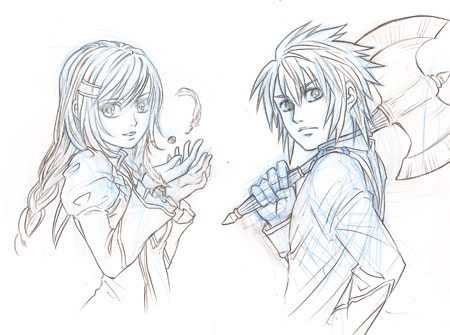
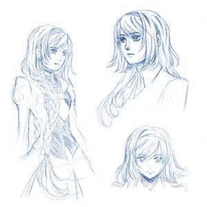
As a bonus, here's the line-art for the two header character art I've done so far. Instead of using a pen to ink the line-art, I drew the sketch in blue pencil and "inked" it with pencil, and so I like the nice softer effect it leaves? I plan to add header art for the rest of the characcters too in my spare time.

A lot of things were going a little haywire in the background over the last few days as I was putting this up, but I think most things should be working properly now? If you find anything that doesn't work, please comment in this entry to let me know about it, or if you have any suggestions you should leave a note as well :>

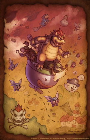
Koopa Armada

Koopa Armada

I've always had a soft spot for Bowser ever since Super Mario RPG :B This was something I worked on during the semester that I managed to finish in time to sell as a print at Fanime. Unlike many of my past illustrations, this one incorporated heavy use of layers, now that I actually know how to use them more effectively thanks to my Digital Illustration class this past semester @w@

Azalea!

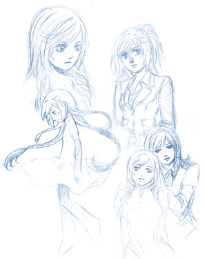
Azalea Sketches

I sketch Azalea a lot when I'm bored :B These were some from last year.

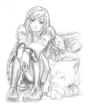
Azalea Sketches

Another sketch from last year for somebody who donated money to me *_*

Magnolia Sketches

And some sketches of Magnolia too :D

Variations on a Theme

Variations on a Theme

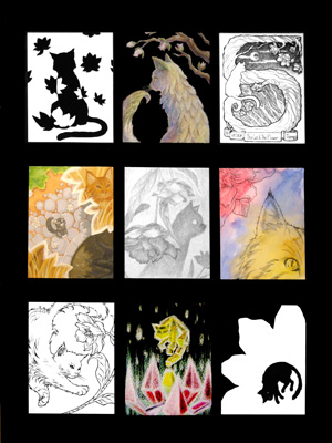
This was an illustration, or I guess a series of mini-illustrations, done for a class I had last spring taught by Dorte Christjansen, one of my very favorite professors I've had at Fullerton thus far. :D It was our first project and we were to choose two subjects and arrange them together in various ways based on certain criteria and illustration techniques she taught us, and being a fag for cats and plants of course I chose to do the flower and cat. :')

It was during this semester that I got Rupert. I think shortly after this project was due. Aheheh. >__> Even the little cat in the middle-left illustration looks like Rupert--I can't remember if it was just because I had already seen a photo of him, or if it was because I've just subconsciously always wanted a cat exactly like him. o_o

Anyway, mediums used in this project include pencils, color pencils, inks, watercolor, and gouache.

Alatus Institute Emblem

It's been a busy week, and it looks like it's gonna remain that way until next Wednesday at least, but I feel like lately I've finally been getting a better hang of managing my time properly. My room's actually pretty orderly and clean right now, which is to say that I'm not dying I guess.

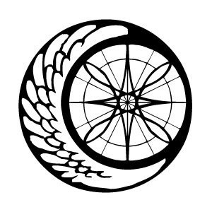
A long, long time ago I made the emblem for the Alatus Institute using just pen and rulers and stuff, and scanned that into the computer and somehow vectorized it using some shady freeware that I managed to find that automatically converted it for me. Of course, the nature of shady freeware that automatize tasks that require the intuition of a real live human being meant that the same vector file I've been using since 2002 or whatever has been fundamentally flawed, and me being a vector dummy did nothing about it.

Old Alatus Emblem

Usually the logo was either small enough or obscured enough that I think most people probably didn't notice how crooked and crappily-made it was (or did they??), but it's always bothered me nonetheless. SO, one of the first things I did when I actually learned how to work with Illustrator (other than the Slime Mansion logo) was re-vectorize the Alatus emblem! Properly!

Alatus Emblem

Woo new emblem woo silky smooth mmm!

...E-except when I showed my friend Tina, she commented on how the old emblem looked more organic while the new one felt a bit sterile. :< Ohwell. So now I've got some hand-drawn renditions of the emblem that I'm working on instead. 8D() I'm thinking that ultimately I'll probably end up with maybe three versions of the emblem: the current new one, a simplified one, and a hand-drawn organic-looking one. And I guess I'll just alternate between the three on a case-by-case basis?

ramblerambleramble I'm going to bed good night XO

Heaven

Heaven

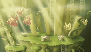
The second Illustrator project in my digital illustration class this semester was to make a internet game background based on a theme he provides each of us. The theme I was given was "heaven." I had a tossed a few ideas around for it, but ultimately I ended up drawing cows again, + other livestock? aheheh. o_o

The week before the project was due my professor taught us how to use the gradient mesh tool, which I ended up abusing for the entire project. It was a bit of a masochistic endeavor in that it took forever to do, but I sorta liked it. >__> I had vowed to myself that I wouldn't stay up all night again for this project like I did the last, but alas! Better luck next time D:

Incidentally, I just got a job (!!) as a graphic artist in my school's Graphic Services department (hurray steady income!!) so I guess I'll be getting a lot more practice with vector stuff from now on. :X But normal pencils and digital paint illustrations will always be my true love!!!

Cottontale Creations

Cottontale Creations

Last semester in my business writing class, we had a group project where we had to come up with a business plan to present to class. The idea I came up with for my group was Cottontale Creations, an online t-shirt company that specializes in "Comic Tees"--t-shirts that tell stories. Basically, the plan was to set up this t-shirt company where we would release t-shirts in a series of three shirts or so, where each illustration on a shirt represents a "panel" within a comic, and all three shirts put together tell a complete story. The example we used for our presentation were these little doodles I made of Little Red Ridinghood:

Rupert >3<

Rupert Sketches

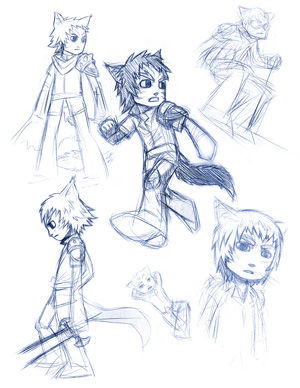
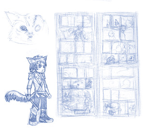
These were sketches done of Rupert last year before I started drawing the actual comic. I guess it's sort of like pre-production, except my thought process when it comes to comics is not nearly as refined and polished enough to really label it as such. 8D() A bit of experimentation with different outfits and minor changes to his hair going on, with a bit of extreme winter sports thrown in there. o_o

Rupert Sketches

As always my thumbnails are a complete mess and indecipherable to anybody but myself. And yes, a lot of the panel boxes are empty too--usually if I just place the box where it's supposed to go in the thumbnail, it gives me enough of a reminder as to what's gonna go in there. If you can even tell what's going on, the final layout ended up a tad bit different, but for the most part it's all there? ah ha ha why am I even posting this _-_

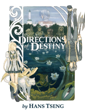
Directions of Destiny Book Cover

Directions of Destiny Book Cover

Not actually a real book cover though; this was a project done back in Spring '08 in my Illustration class. The assignment was to pick a book and create a new book cover for it using illustration techniques and mediums we learned in the class. I asked my professor if I could use my own book (so that way it's more relevant to the rest of my gallery 8D()) and she OK'd it, so this was what came out of it!

The whole thing was done in gouache on a big 18"x24" piece of I think watercolor paper that my professor gave to me, and one of the most distressing aspects about the project was finding a scanner for this thing! XO Originally it was scanned in pieces and put together on the computer, except the colors were totally crappy when I did that. Eventually we found a Kinko's with a large-scale scanner which I had to pay like $10 to use, but at least it gave me an image that was actually presentable! @_@

Incidentally, I did some more work on my Art Archives from Wednesday and now I have an automated script set up to thumbnail anything I upload and display onto the server on the fly. ;D This'll give me more motivation to upload my sketches cause I won't have to worry about thumbnailing them all the time now!! Woooo @_@

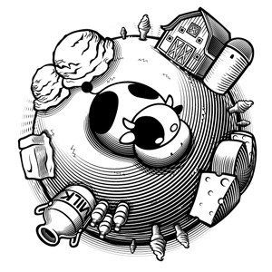
Dairy Products

For our first real project in my Digital Illustration class, we were to choose a subject and create a circular emblem of sorts for it in black and white using Illustrator. Examples for subjects included things like sports, dance, hobbies, people, etc. etc. I chose to do mine on dairy products. :B

Dairy Products

This was pretty much my first serious attempt at doing stuff in Illustrator outside of the Slime Mansion logo I did before, so a lot of time was spent fudging around, but basically I became very familiar with the Blend Tool while working with this project @_@ Although I haven't really used it again; it's good for black-and-white stuff, but the next project we did was in color, so I became best friends with a different tool for that one, which I'll post here eeeveentuaallyyyy!

2