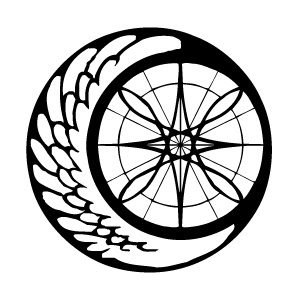
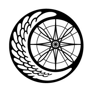
Alatus Institute Emblem
It's been a busy week, and it looks like it's gonna remain that way until next Wednesday at least, but I feel like lately I've finally been getting a better hang of managing my time properly. My room's actually pretty orderly and clean right now, which is to say that I'm not dying I guess.
A long, long time ago I made the emblem for the Alatus Institute using just pen and rulers and stuff, and scanned that into the computer and somehow vectorized it using some shady freeware that I managed to find that automatically converted it for me. Of course, the nature of shady freeware that automatize tasks that require the intuition of a real live human being meant that the same vector file I've been using since 2002 or whatever has been fundamentally flawed, and me being a vector dummy did nothing about it.
Usually the logo was either small enough or obscured enough that I think most people probably didn't notice how crooked and crappily-made it was (or did they??), but it's always bothered me nonetheless. SO, one of the first things I did when I actually learned how to work with Illustrator (other than the Slime Mansion logo) was re-vectorize the Alatus emblem! Properly!
Woo new emblem woo silky smooth mmm!
...E-except when I showed my friend Tina, she commented on how the old emblem looked more organic while the new one felt a bit sterile. :< Ohwell. So now I've got some hand-drawn renditions of the emblem that I'm working on instead. 8D() I'm thinking that ultimately I'll probably end up with maybe three versions of the emblem: the current new one, a simplified one, and a hand-drawn organic-looking one. And I guess I'll just alternate between the three on a case-by-case basis?
ramblerambleramble I'm going to bed good night XO


Definitely an improvement :)
You could try using some brush styles in Illustrator to give a slightly more organic feel while maintaining crispness. Then you won't have to hand-render again.
I was planning to really go all out with lots more details in the organic version of the emblem though, so it'd be a pain to do all of that in Illustrator ha ha D:
It does look less organic but I like it. I think it fits with DoD. The original reminds me of a stamp that hasn't been inked well. I never really noticed before though. :)
I think the main difference is in the feathers (which, literally, are supposed to be "organic"). Vector-based art doesn't have to be all sterilely geometric -- just vary the feathers' shapes and sizes slightly, right?
Well, for the purpose of a logo the most effective ones are usually very geometric and simple, so personally I don't think it's a bad thing that the new logo isn't organic, but at the same time there may be a time and place where I might want a more organic version of the logo which was why I was planning to hand-render a separate copy of it.
I like the size and shape of the star in the circle of the first one. That's the only qualm I have about the revised version. :D