16
May. 2010
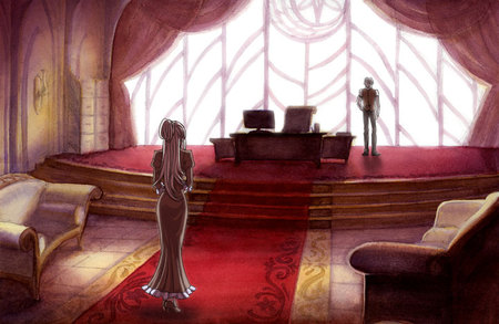
Here's the second in the series of watercolor scenes that I'm working on :D It's the Alatus Headmaster's office!

This one was a little tricky because of all the red going on, and with watercolor different colors have different physical properties when you put it on paper. With the red, after you put it on it tends to come off really easy if you do anything on top of it, and ideally I think it should have been left for the last layer. BUT it wasn't, so once it was put on, the rest of the painting felt like walking on tightrope. D:
SO ALSO. I got a better scan of this painting than the last one! The flatbed scanner at work actually scanned my coldpress paintings without any of the coldpress texture! So that means I don't have to do anything in hot press after all ;D (my prior experience with using hot press was relatively unpleasant, so this development pleases me.)
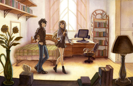
That being said, I rescanned the dorm room picture and changed up the scene a bit. :>

This would be a year prior to the start of the story, with Zephan and Ryan both incoming freshman to the Alatus high school. Ryan, having been a student of the Alatus middle school, is showing Alatus new arrival Zephan around the dormitories.
I'm almost done with the next two paintings so I'll post them up within the next week ;D (which happens to be FINALS WEEK BTW alfksdfjsa;dfaj)
08
May. 2010

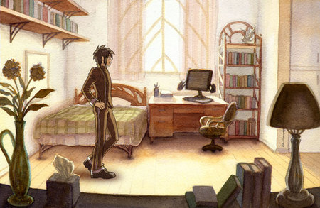
This is the first in a series of watercolor background paintings that I'm working on. :> Unlike the previous environment thumbnails which include places outside the school, these paintings will be exclusively of various areas within the campus of the Alatus Institute.
I stuck Zephan in there to see how it looks, but I'm kind of indifferent about it, because the tooth texture of the watercolor paper stands out a little too much :<a. Apparently if I used a really really good scanner the tooth won't stand out so much though, but by really really good apparently they mean like $1000+ good Dx. It's an interesting effect, but I think I'll try using a hot press smooth paper some time and seeing how it'd look once a character is slapped onto it.
Incidentally, even though Zephan's standing here, this isn't actually his room. D: It's just a showcase dorm, so maybe he's just checking it out on a tour or something D:
04
May. 2010
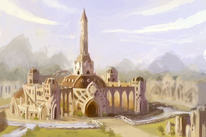
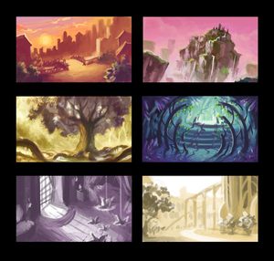
The school semester is coming to a close in the coming weeks :D I thought I'd use this chance to post a few thumbnails of some environments I'd been working on for Directions of Destiny.


Some of these locations you might recognize from the comic, others have yet to be mentioned at all. But it's been very fun working on these concepts, and I'll be sure to put up the full finished paintings when I'm done!!
22
Apr. 2010

I feel like I have all these Internet outlets at my disposal, yet I've failed to make effective use of any of them. D: I guess I rarely feel like I have things worth saying, but with Facebook and Twitter and this whole brave new world beyond LiveJournal these days, I feel like it's such a waste to not use them!! SO, now I'm trying to update my presence on the Internet more?
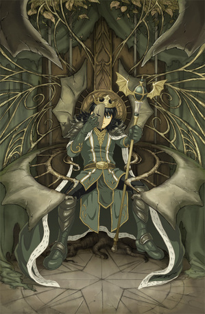
Anyway, a long long time ago I did this picture, and so finally this past summer I gave it a partner illustration :D This was already posted in some other outlets, including as part of the main art gallery on this site, but I thought I'd make a blog entry about it anyway Dx
Truth be told, I had actually put a piece of tracing paper over the original Queen Azalea illustration to do a lot of the detail work in this one, but I tried to give this one a more earthy feel, and where places in the Queen Azalea one were more clean, I tried to mess it up just a bit in this Zephan version.Their color schemes, red and green, are complements too.
I plan on using this image as the cover of chapter 2.7 when I finally get around to doing the actual comic again, but who knows, maybe I'll change my mind about what to put there when that time comes, ha ha Dx
I'm saying it here, I'm going to try to update at least once a week from now on!!
27
Mar. 2010

It's been a while since I updated but I thought it was about high time that I did something about the layout of this site D: I was getting sick of the blue, and the site organization was getting in my nerves too. I hope with this layout everything is more accessible and easier in the eyes :D
Also you may notice that I now have art categories specifically for visual development and vector graphics now! Between classes and my job on Graphic Services on campus, I've been doing a lot more of these kinds of art lately, so I figured they deserve their own categories now!
I think most sections work properly, although I still have to put up a lot of my old art back up on the art gallery, and the store is still not up at all, and I haven't finished my profile at all ha ha Dx. I'm also still planning on fixing up a lot of the current art here though so check back every now and then to see if anything is new :'D
